
The History & Evolution of the Nike Swoosh: How a $35 Logo Became a Global Icon

The Iconic Nike Swoosh Logo
You’ve seen it everywhere — on your shirts, shoes, hats, gym bags… maybe even tattooed on your grandma’s forehead. But where did the Nike Swoosh actually come from? Has it always looked the way it does now? And why is it so iconic that even my third cup of coffee can’t chase away the demons whispering “Just Do It”?
Today, we’re breaking down the history and evolution of the Nike Swoosh, one of the most recognizable and influential logos of all time.
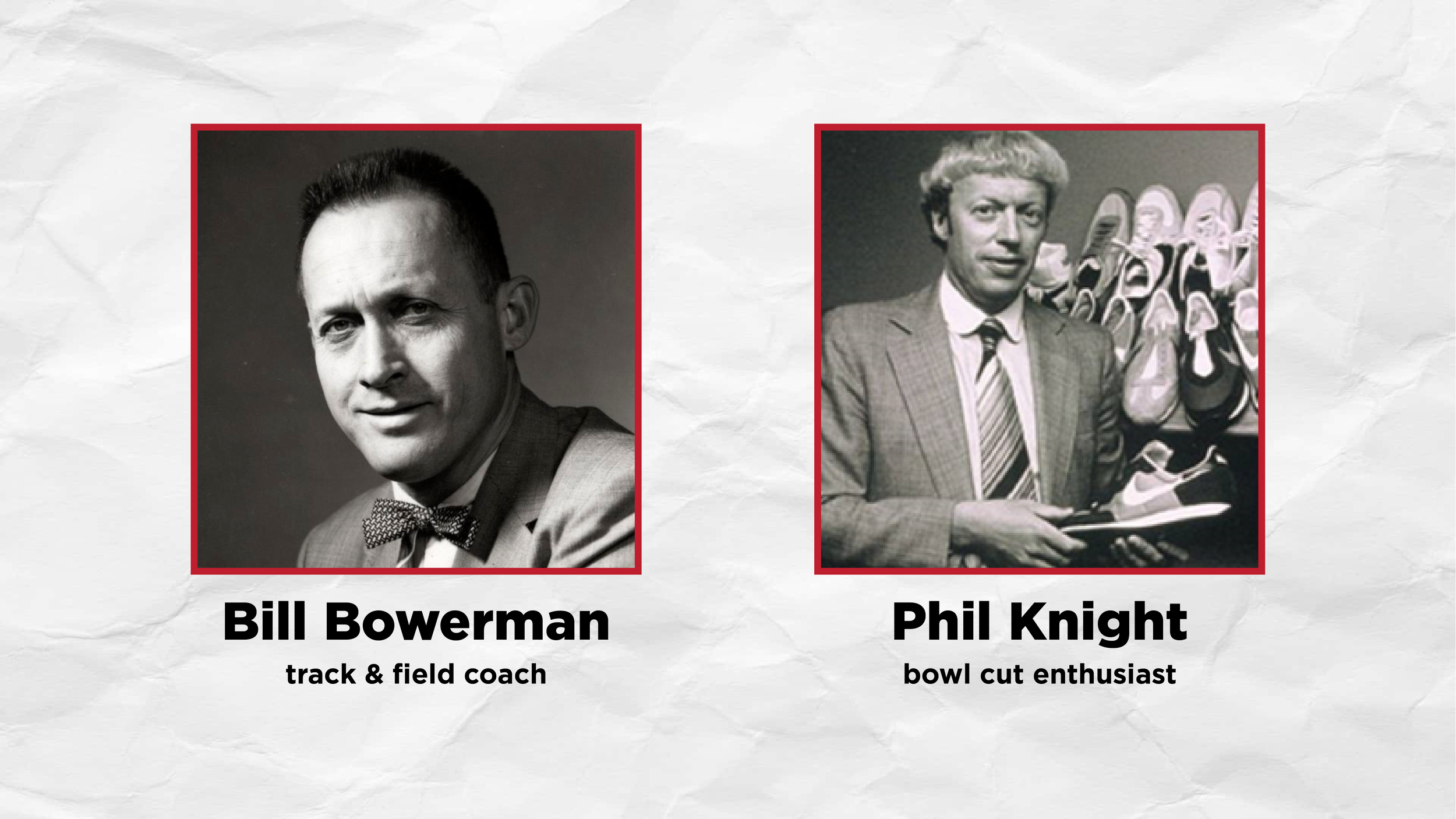
Bill Bowerman (left) and Phil Knight (right) - Founders of Nike
Before the Swoosh: When Nike Wasn’t Nike
In the beginning, there were two men:
Bill Bowerman, a young and wildly innovative track coach, and
Phil Knight, an athletic accountant who doubled as a parking-lot shoe salesman.
On January 25th, 1964, the pair founded a company called Blue Ribbon Sports (BRS). Instead of making their own footwear, they distributed Japanese track shoes from Onitsuka. While Bowerman tinkered with shoe prototypes, Knight sold sneakers out of the back of his car — the ultimate grind mentality long before “entrepreneur TikTok” existed.
Business boomed. BRS doubled revenue every year, reaching $1.3 million in sales by 1971.
But then came the chaos.
Despite their profits, the BRS bank pulled out because the company had low equity. And their Japanese supplier, Onitsuka, was secretly hunting for a new U.S. distributor. Eventually, Onitsuka tried to buy BRS outright.
Bowerman and Knight weren’t having it.
With no bank and no supplier, Bowerman basically said:
“Screw it — we’ll make our own shoes.”
Only one problem…
They didn’t have a name or a logo.
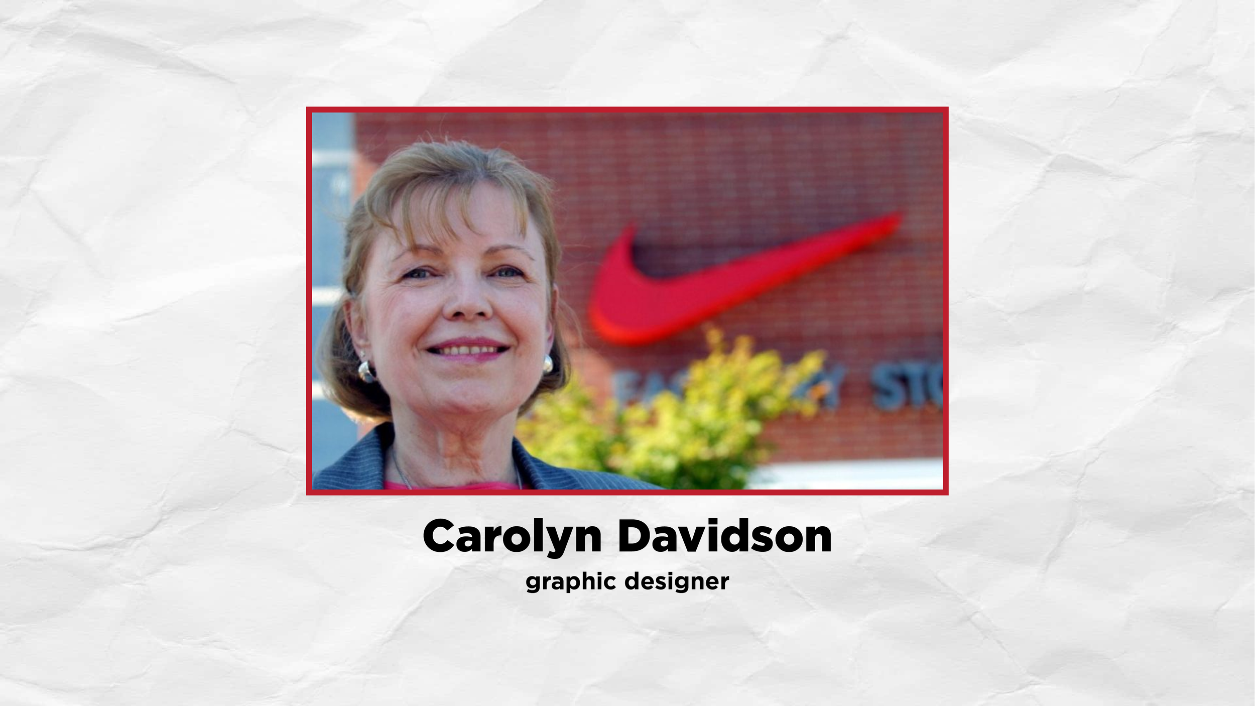
Carolyn Davidson - Graphic Designer behind the Nike Swoosh Logo
Enter Carolyn Davidson: The Student Who Drew a $7 Million Shape
While teaching at Portland State University, Knight met Carolyn Davidson, a graphic design student. He told her he needed a logo that represented movement.
And with that simple direction — the Swoosh was born.
But they still needed a name.
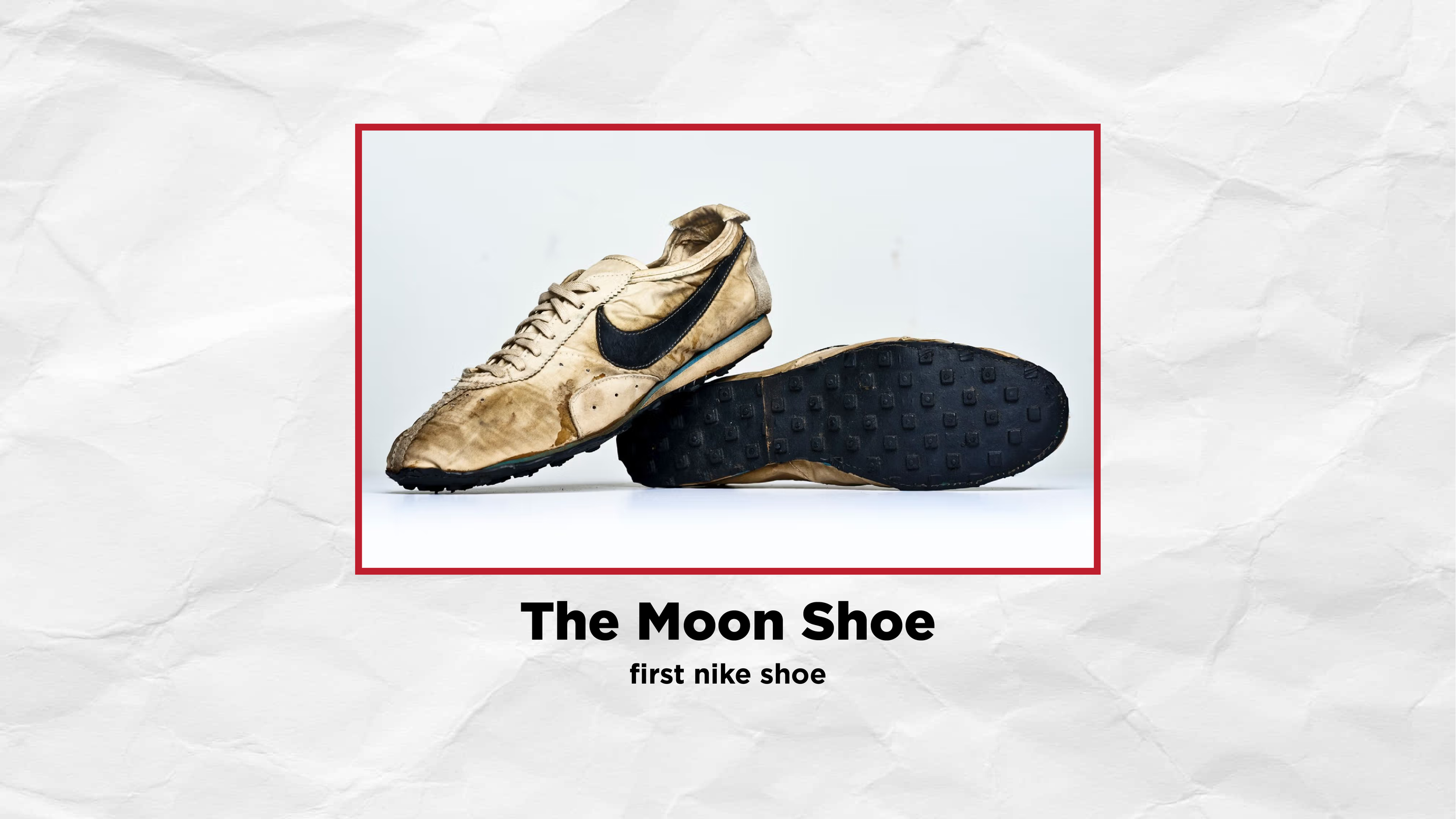
The original Moon Shoe - first shoe under the Nike brand
“Her Name Is Nike…” A Dream Creates a Brand
BRS’s first full-time employee, Jeff Johnson, called his bosses one night with a name he dreamt about:
“Nike – the Greek Goddess of Victory.”
(And if your dreams ever name massive corporations, please contact me immediately — we’re starting a business.)
The name stuck. The logo was ready. Knight grabbed his waffle iron (yes, a real waffle iron), and the first ever Nike shoe — the Moon Shoe — was created.
Unfortunately, this moon shoe did not make kids jump three times higher like those trampoline foot contraptions we all bought in the 2000s. It did, however, put Nike on the map.
In 1972, Onitsuka discovered Nike’s existence and sued BRS for violating their non-compete.
BRS countersued for breach of contract.
In 1974, BRS won.
Nike spread her wings, absorbed Blue Ribbon Sports in 1976, and grew into the global sports superpower we know today.
Multiple iterations of the Nike logo
The Evolution of the Iconic Nike Logo
Despite being over 50 years old, the Swoosh has remarkably stayed nearly identical since its creation. But the branding around it? That’s changed several times.
Let’s look at its evolution.
The first Nike logo
1971–1976: The Original Swoosh + Script Logo
Carolyn Davidson designed two early versions:
The classic solid Swoosh — the one we still use today.
A script version — featuring an outlined Swoosh with “Nike” in a cursive font inside the curve.
The script version feels dated now, but back then it gave the brand a more personal, handmade charm.
Second Nike logo - conveying movement
1976–1985: The Bold, Slanted “Movement” Logo
Nike upgraded to a bold, slanted sans-serif font paired with the swoosh. For the first time, the typography conveyed speed and momentum — exactly what Knight had envisioned.
The foot of the “E” even blended into the swoosh, symbolically unifying the wordmark and icon. This became Nike’s primary logo for nearly a decade.
Third Nike Logo - boxed in
1985–1995: The “Boxed In” Era
In this phase, Nike took the 1976 logo, enclosed it in a solid box, and inverted the colors — essentially creating a high-contrast badge version.
While not a full redesign, it added strong visual presence during a decade defined by bold branding and vibrant sports culture.
Current Nike Logo - the lone icon
1995–Present (2025): The Icon Stands Alone
Since 1995, Nike has embraced the simplicity and power of Davidson’s original design. The Swoosh often appears entirely on its own, without accompanying text — a sign that the mark has transcended language.
Which raises the million-dollar question…
How Much Was the Swoosh Designer Paid?
Carolyn Davidson received $35 for designing the Swoosh.
Adjusted for inflation?
About $273.
A steal… but luckily, Nike didn’t forget her.
Davidson later worked at Nike for several years and built a successful freelance career using her experience there. In 1983, Nike held a celebration in her honor. Phil Knight even gifted her:
A custom gold & diamond Swoosh ring
500 shares of Nike stock
Today, those combined would be worth roughly $7 million.
Not bad for a 30-minute student project.
The Legacy of the Nike Swoosh
The relationship between Davidson and the Nike founders reflects something rare today — genuine appreciation between executives and designers. Whether she was simply in the right place at the right time or truly had a visionary eye for design, her work has shaped more than half a century of sports culture.
The Swoosh will outlive every one of us.
It will remain one of the most iconic, recognizable, powerful logos in human history.
And it all started with a student sketch, a waffle iron, and a dream call at 3 a.m.